CHARLOTTE BRENNAN
Graphic Designer & Creative Marketing

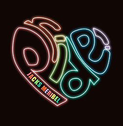
Pride
Client: Jacks
Jacks Pride is an annual spring event celebrating inclusivity, self-expression, and community within the Three Valleys. As part of the event's rebrand, I developed a new visual identity designed to create greater consistency across future editions while strengthening recognition of the event.
The challenge
-
The existing logo needed developing further to create a more cohesive identity that better reflects the energy, tone, and atmosphere of the event.
-
This project required a wide range of deliverables to bring the event to life across every touchpoint. I was responsible for producing a cohesive visual identity and applying it consistently across marketing materials, social media assets, print collateral, and on-site branding.
-
I had to develop promotional content, signage, and supporting event materials to ensure a clear and engaging experience for attendees from first contact through to the event itself.

The solution
-
The updated design strengthens the connection between the visual identity and the event experience, ensuring it feels more relevant, dynamic, and aligned with its audience.
-
The project centred around the creation of a versatile logo system that could be applied across a wide range of touchpoints, from promotional posters and digital marketing to event signage and printed materials. I provided two logos - one that could be used across the website and social media and one logo for printing without the neon glow.
-
The resulting identity provided a flexible branding framework that could be used across both marketing and event-day materials, creating a more recognisable and professional presence for Jacks Pride.

Marketing materials


