CHARLOTTE BRENNAN
Graphic Designer & Creative Marketing

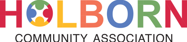
Holborn Community Association
Client: Holborn Community Association
Holborn Community Association create the spaces and opportunities for individuals, groups and the wider community in Holborn to thrive. They aim to support individuals to build their skills, confidence and overall well-being. Their spaces reduce isolation and offer the chance to build new, meaningful relationships.
The challenge
-
Holborn Community Association needed a logo that could bring together a diverse community under a single, recognisable identity. The design needed to represent collaboration and inclusivity while providing a flexible foundation for future marketing and communication materials.
The solution
-
Drawing inspiration from the organisation's role in bringing people together, I developed a visual identity centred around community, connection, and inclusivity. Multiple concepts were explored before refining the chosen direction into a simple yet meaningful logo that could work effectively across a variety of applications. The final identity provided Holborn Community Association with a recognisable and adaptable brand asset that reflected its purpose and strengthened its presence within the local community.


Evaluation
Looking back, I would refine these logos to move away from the typical community brand style and develop something more distinctive and tailored specifically to HCA’s identity. I would focus on creating a more unique and personable visual direction that better reflects the character of the organisation.